Feature Design
Zoom Case Study
I grouped with student designers to analyze current videochatting platforms. Our research led to the design of an in-call Zoom feature aimed to improve efficiency and ease of video calling during quarantine.
- Role
- UI/UX Designer
- Contributors
- Harmony Jackson, Bharati Mahajan, Sonali Patel
- Year
- 2020
- Duration
- 2 months
Problem
Work-from-home user
During quarantine, people are looking for ways to effectively interact virtually and adapt to work-from-home lifestyles. They are becoming reliant on video chatting platforms, such as Zoom, to communicate and run their businesses. With changing user habits, how can we improve this product to make the work-from-home experience easier and more efficient?
Solution
In-call feature
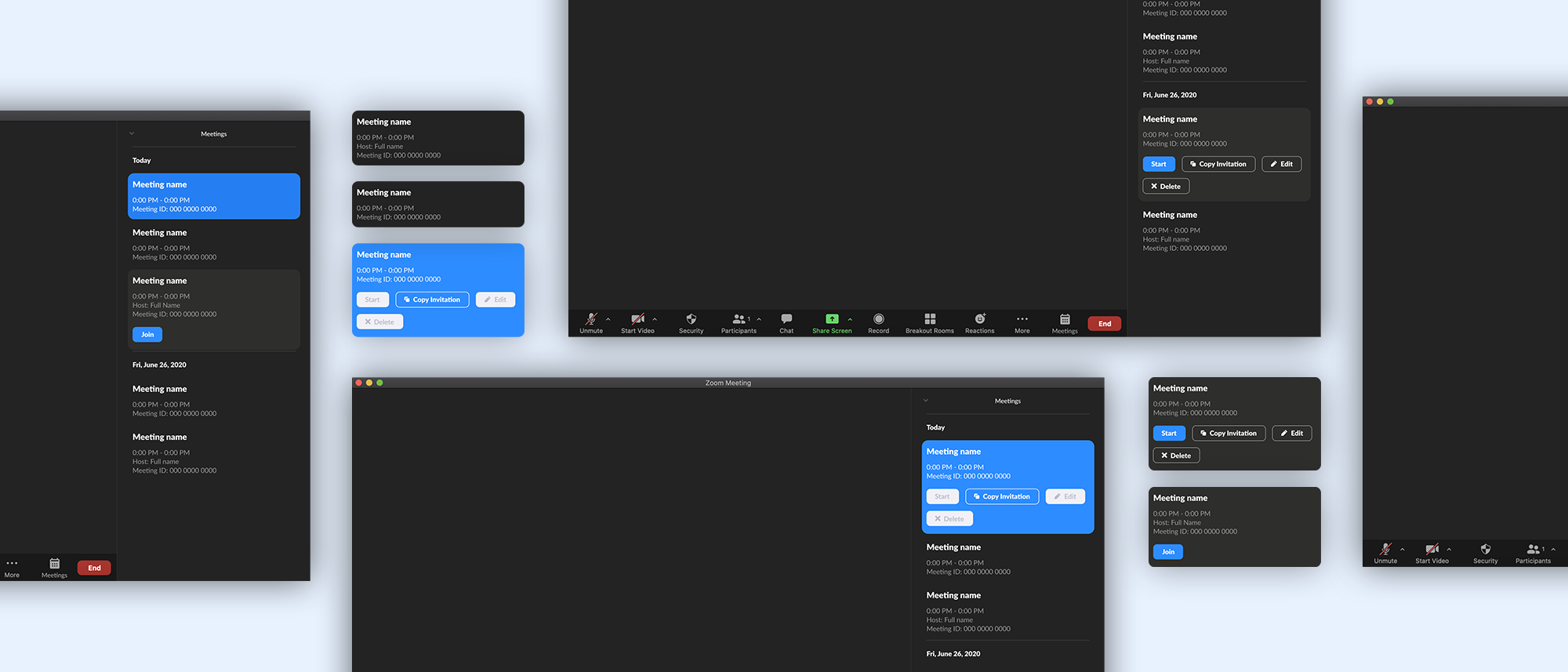
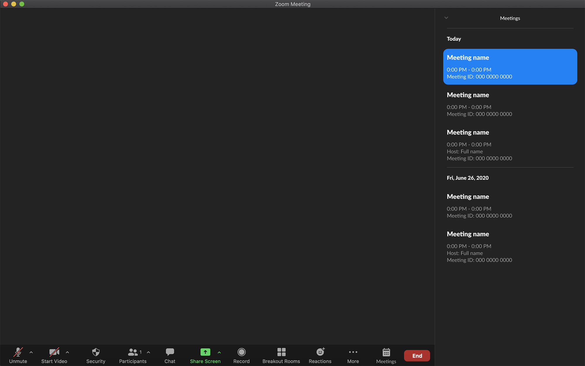
The in-call meetings feature helps users quickly navigate between meetings and access their schedules and information while in ongoing calls. Information and actions are consolidated into a concise and accessible window to make the process of organizing and attending virtual meetings simpler and faster.
Competitor analysis
To begin our process, we researched existing popular video chatting platforms. We directly compared features of Microsoft Teams, Google Meet, and Zoom.

Interviewing video chatters
To gain more user perspectives, we interviewed individuals on their video chatting habits, most used platforms, and problems with existing products. We found Zoom to be one of the most used and decided to focus on improving the single product.

Zoom user survey
With a focus on Zoom, we wanted to learn more specifically about its user experience and identify potential problems. We sent out a survey to current users.

Personas
Based on our survey results, we created four personas to represent the range of customers and various uses of the product.


Ideation
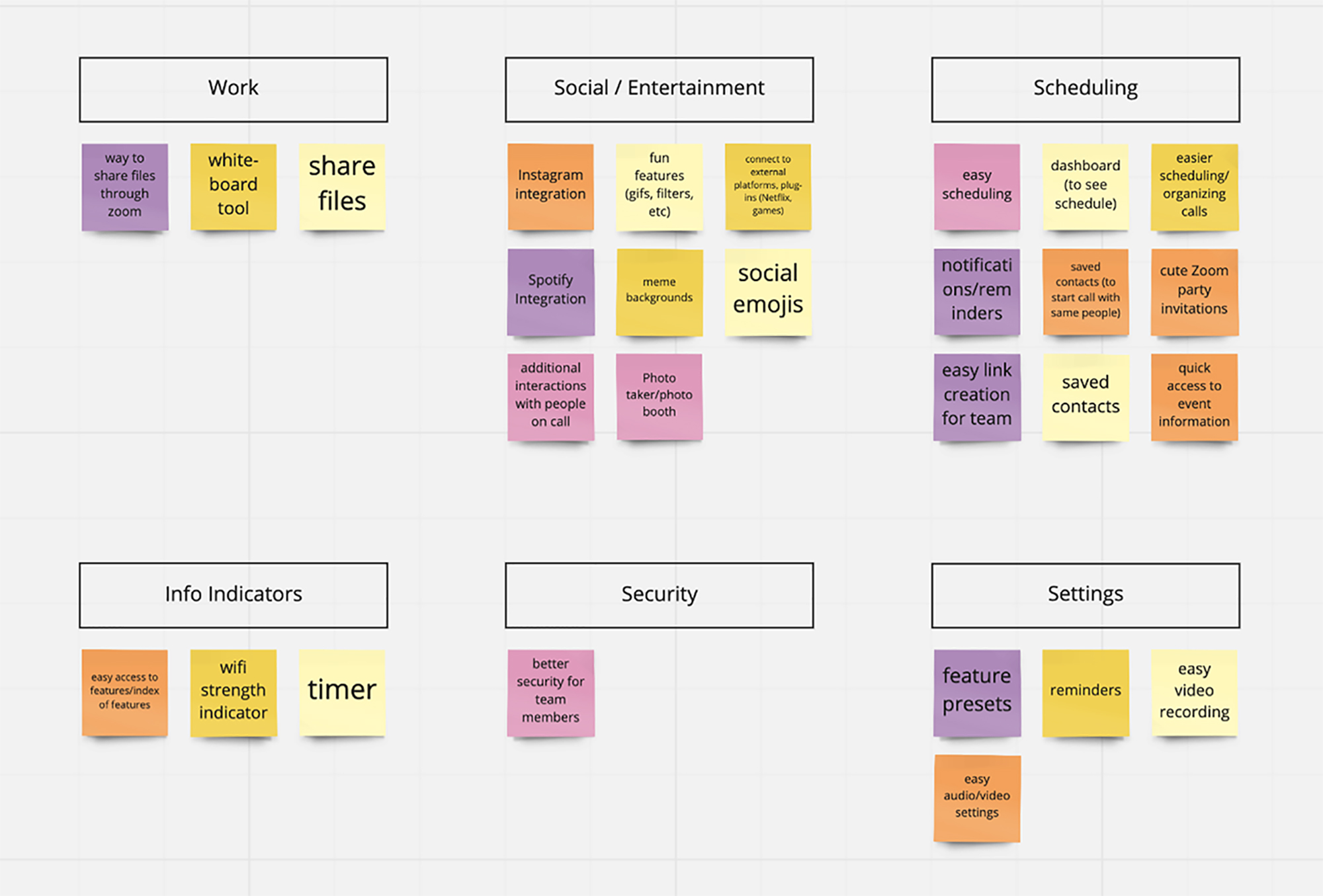
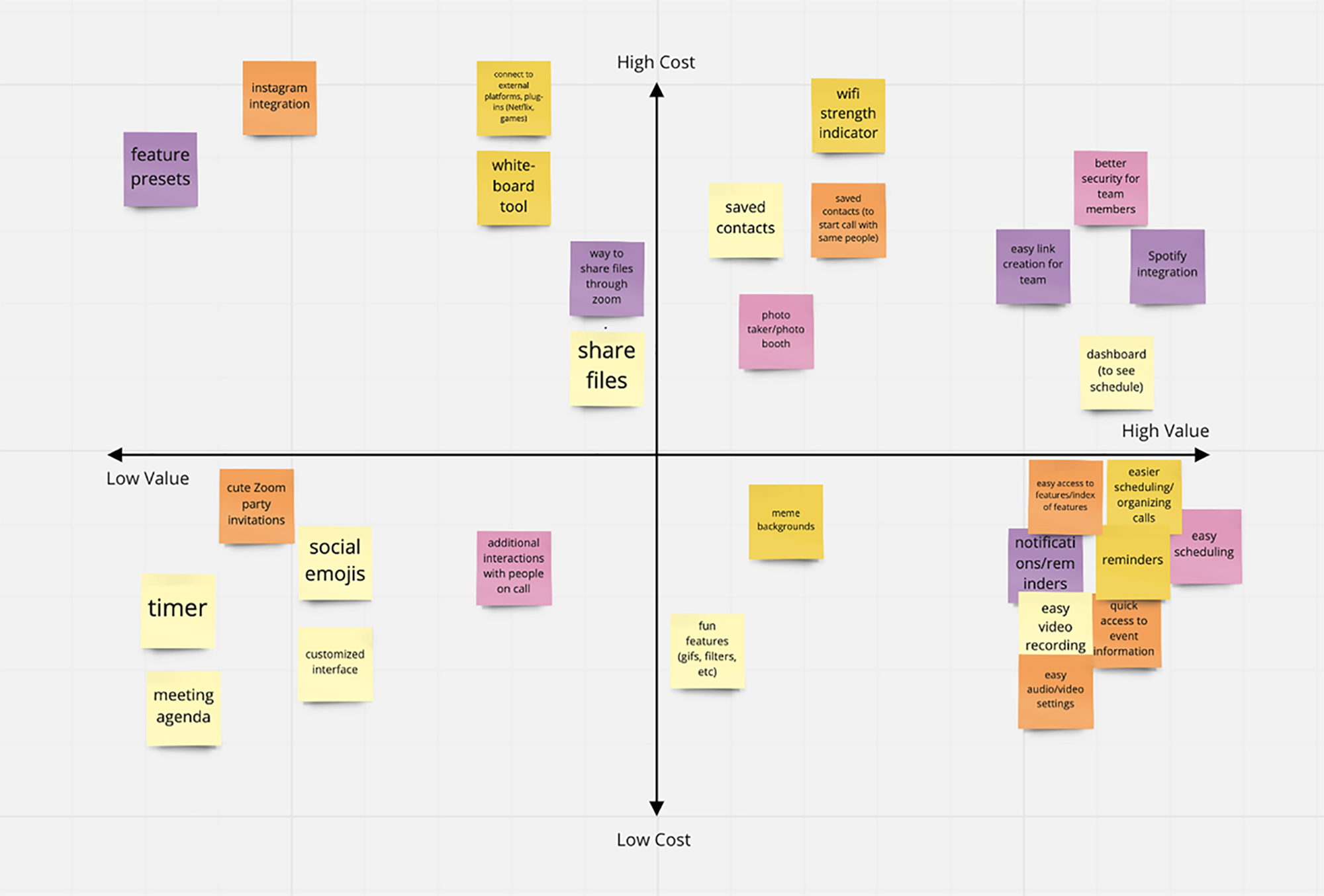
With a better understanding of the products existing pain points and user contexts, we moved on to brainstorm potential features and improvements. We performed two exercises to help prioritize ideas and identify which ones were most practical.
Wireframes
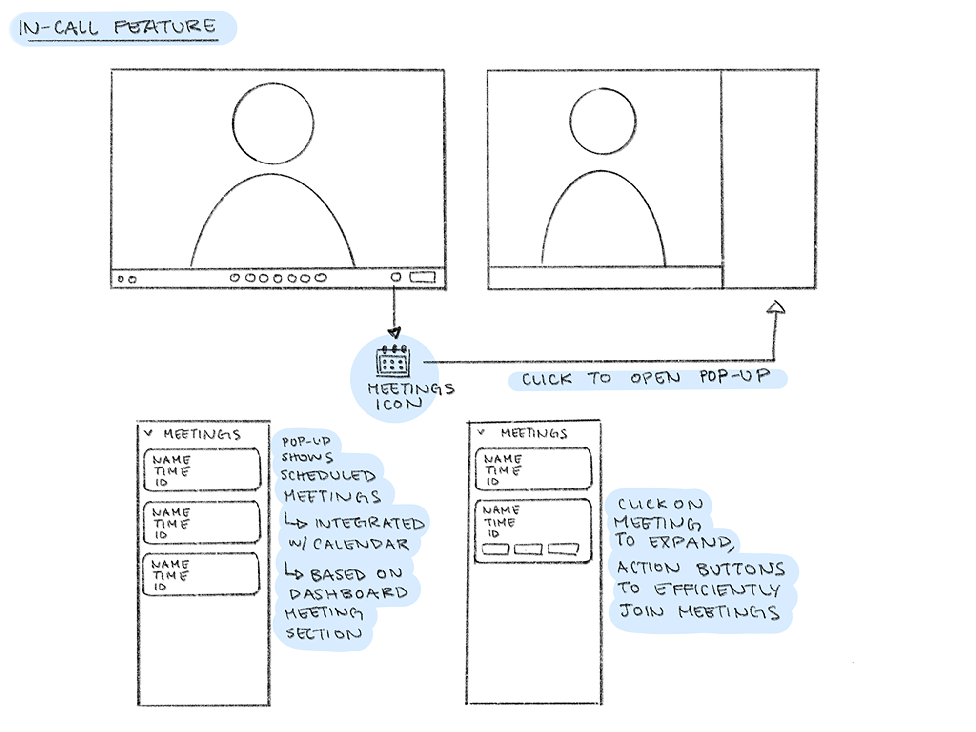
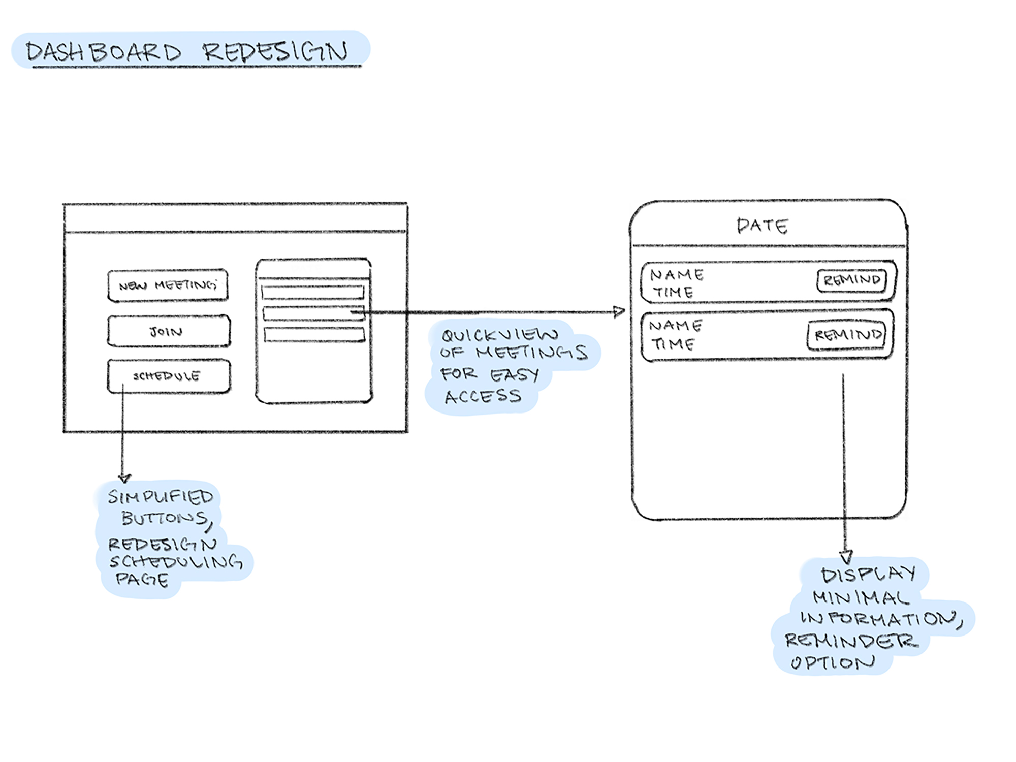
Once we pinpointed which areas of the product we wanted to focus on improving, we drew basic wireframes to begin visualizing our solutions. We came up with two directions: an in-call feature and a dashboard redesign.
Iterating on wireframes
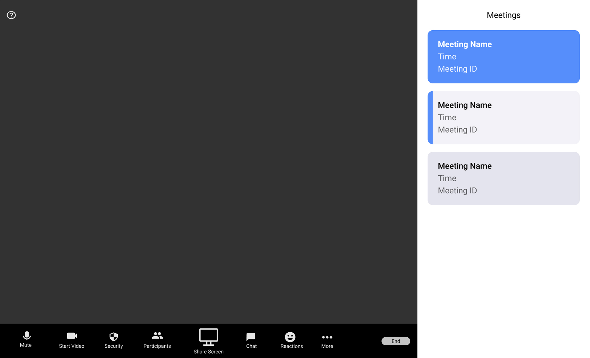
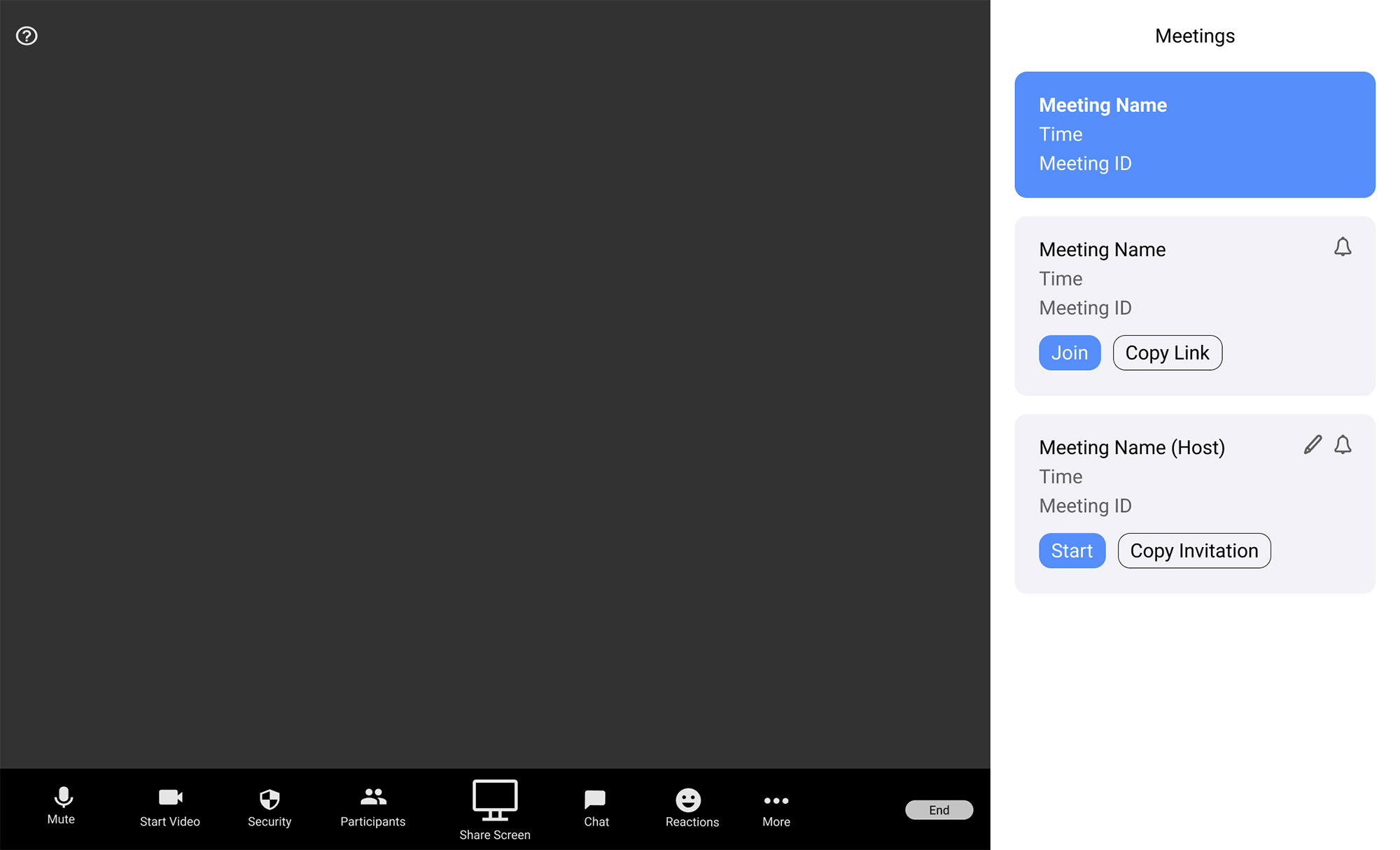
We continued to iterate on the in-call feature and tested out various indicators and details on users.
High Fidelity Prototype
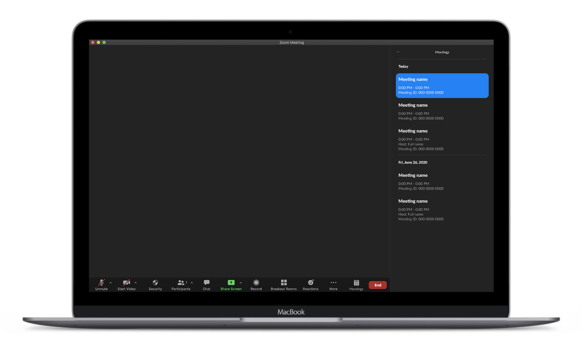
Pop-up window
In-call meetings window is designed to fit the format of existing features and interactions.
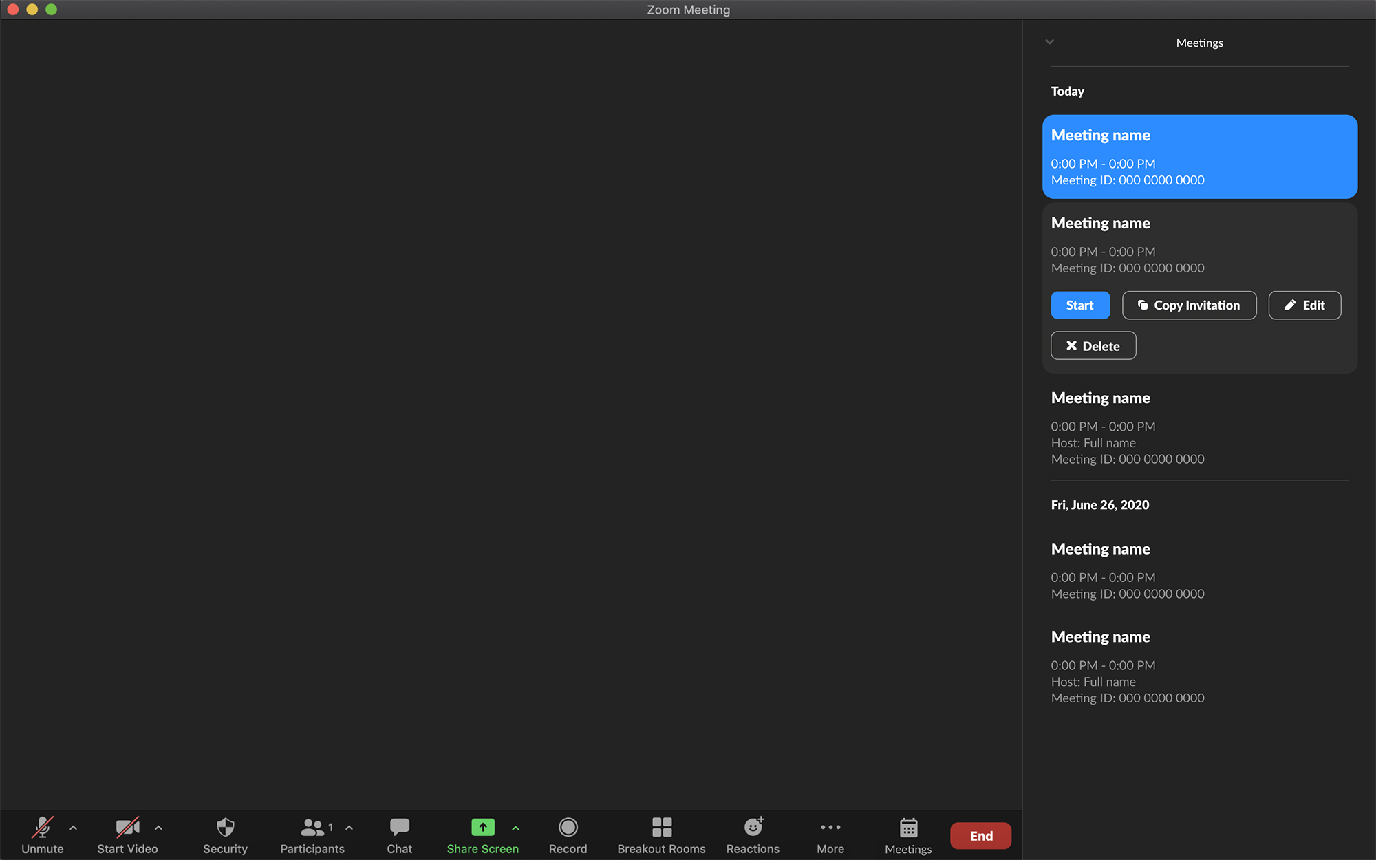
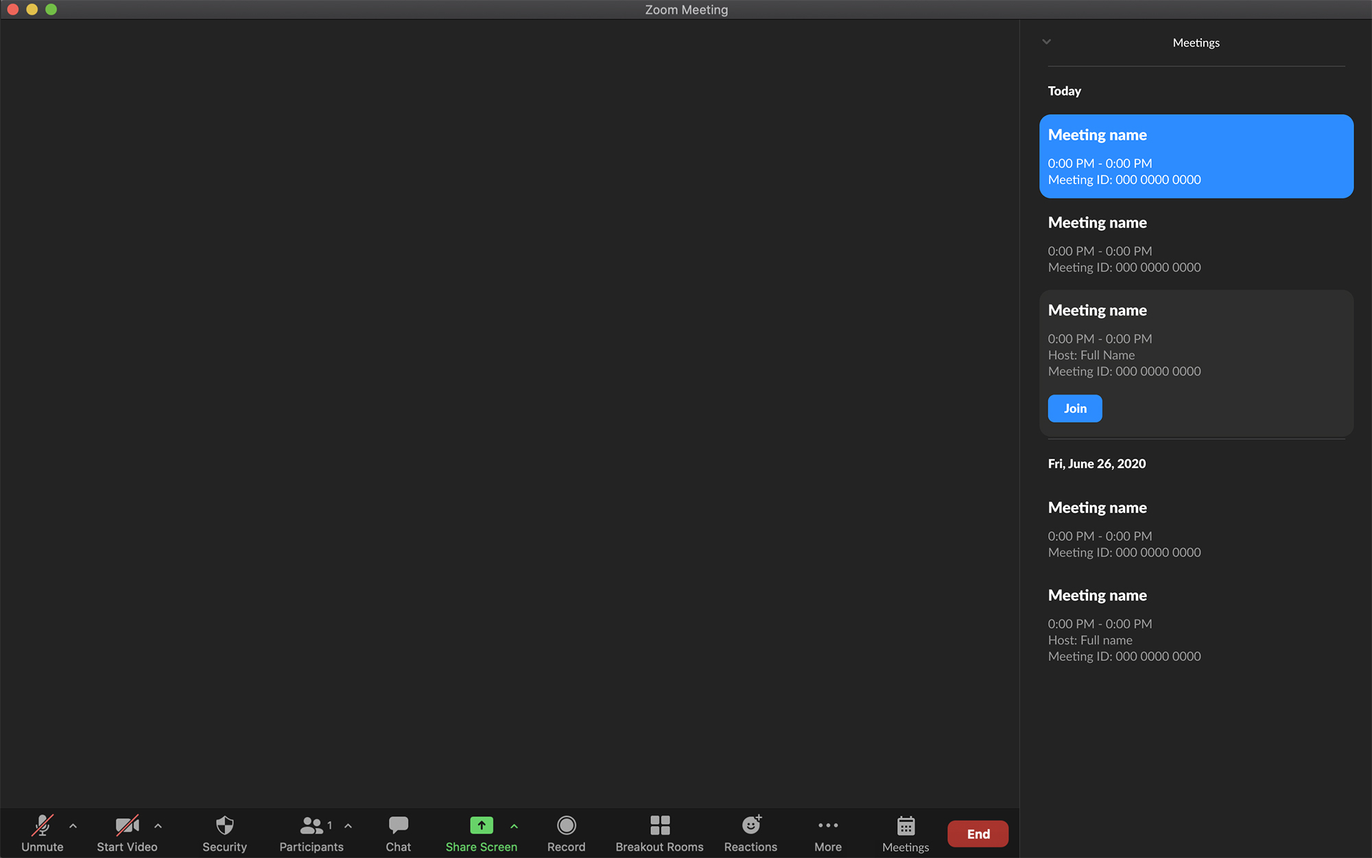
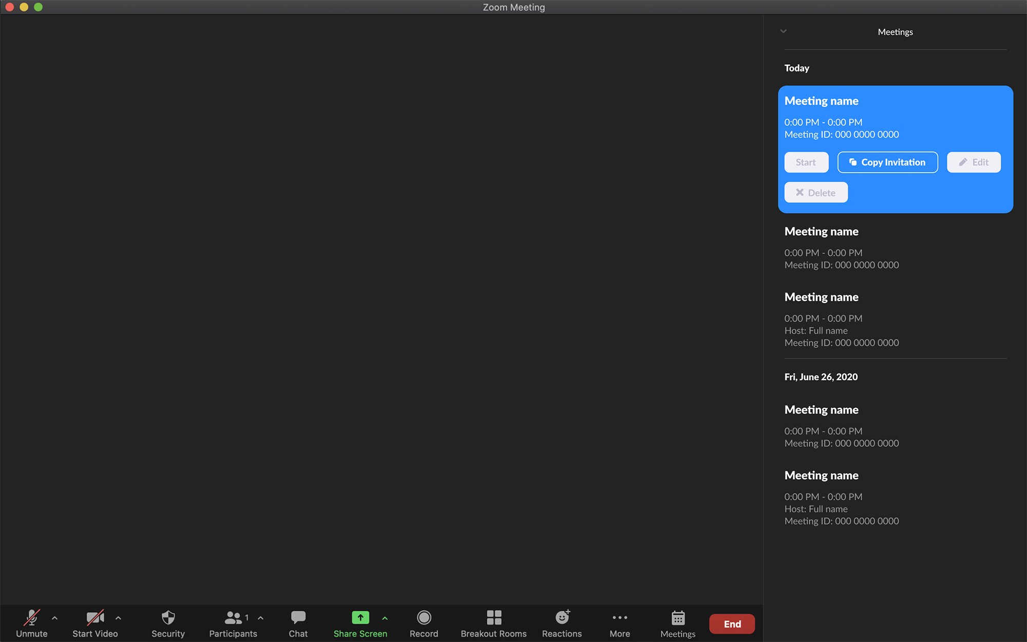
Meeting buttons
Key information and actions are displayed to allow for efficient transitions between video calls and easy access to call links.
View clickable prototype