Company Portal, UX Design
Patent Portal
I designed the information architecture and interface of a client-facing portal for the delivery of patent services and worked alongside lawyers to learn about patent process and workflows in the process.
- Role
- UI/UX Designer
- Company
- Am Law 100 law firm
- Year
- 2020
- Duration
- 3 months
I was tasked to help a top Silicon Valley law firm design the client-facing side of their firm portal. They provided me with a screen of their current portal design to base the visual design off of and a general list of the content to be included. I met with a lawyer once a week to show my progress and get feedback. The final deliverable for this included a Powerpoint presentation, clickable prototype, and software engineering specifications.
I am unable to disclose the name of the firm or any content of the portal that is specific to the firm's process and work. Therefore, I will be changing all instances of the firm's name to "firm" and removing any confidential content. If you'd like to view the final more in-depth or learn more about this project, please reach out to me.
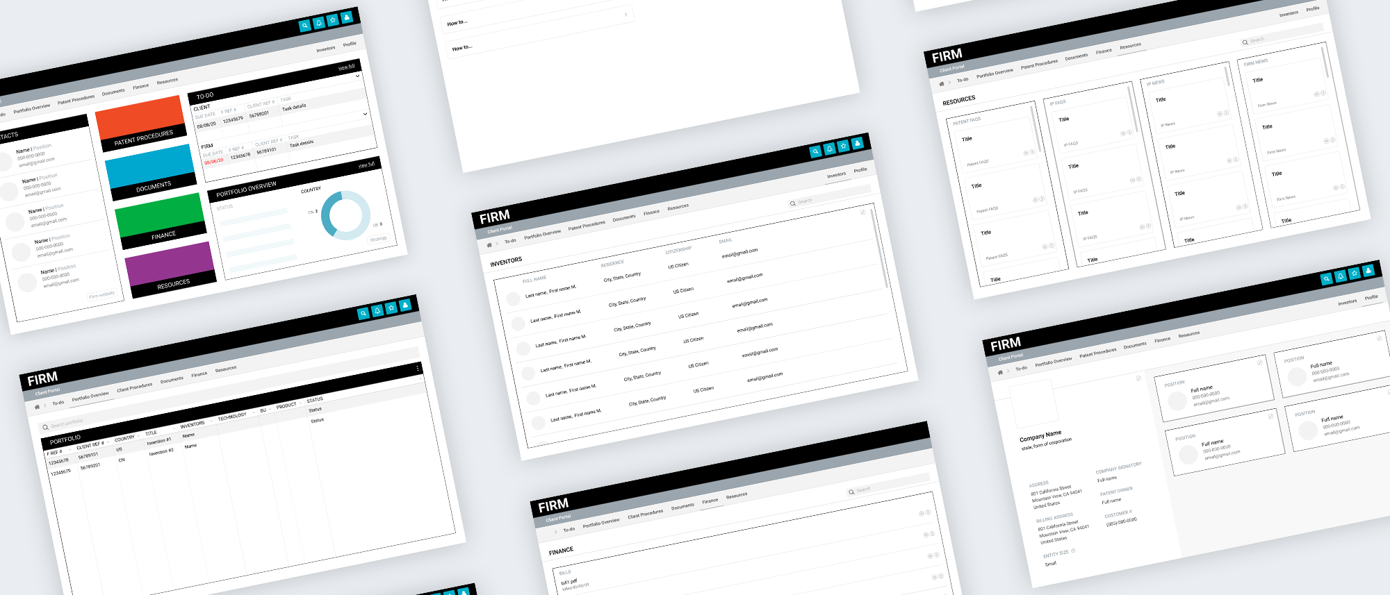
Portal content
During the first meeting, I was given an overview of the patent process and provided a general list of the types of information and content to be included in the portal. I began my process by brainstorming different ways to group and organize the information.


Home page
Based on the three brainstormed ways of organizing information, I created wireframes of the home page and explored potential components and features.


To-do list
Before making any decisions on the home page design, I wanted to design the individual sections of the portal. The first section was the to-do list, a list of tasks to be completed. Some considerations for the design of this section included: - Keeping an excel sheet format with set column headings - Dividing tasks by substantive and administrative type tasks - Clearly labeling what tasks were to be done by individuals from the firm vs. from the firm’s client I started by ideating different ways to visually organize tasks by type.


I then tried some more complex designs with more organization options and customization.


Lastly, I explored some smaller details and indicators.


Portfolio overview
The next most important section was the portfolio overview. This section includes all the current and past portfolio cases of the firm’s client. Some considerations for the design of this section included: - Being able to group cases based on information - Showing case progress - Being able to view more in depth case information and details My idea for this section was to include a general list of cases that could then be clicked on for more information on each case. I started by wireframing the general list and thinking of different ways to visually group cases.


I then moved on to design the layout of the subsequent page displaying biographic information, documents, updates, and other information for each individual case.


Finalizing the to-do list and portfolio overview
Based on the firm’s feedback, I was able to finalize the two primary sections of the portal. I went ahead and prototyped the screens to fit the design system and visuals already determined for the portal.


Additional sections
With the primary sections completed, I moved on to design the rest of the sections. Based on the information and directions given by the firm, these sections were straight forward. With less iterations needed, I decided to start with more high fidelity prototypes and made a round of small edits based on the firm’s feedback.


Finalizing the home page
With all the sections completed, I went back to designing the home page. Based on feedback from my previous wireframes, I had a clearer idea of how to divide the home page. Since the immediate contacts, to-do list, and portfolio overview were most important, I allocated more screen space to them. I also designed a preview for the portfolio overview and to-do list to give users quick access to some of the information within each section.
