Mobile App Design
Edge
I worked on an interdisciplinary team of students to design a job search application for students.
- Role
- UI/UX Designer
- Contributors
- Ying Chen, Maggie Lin, Erin Ryan
- Year
- 2017
- Duration
- 3 months
Problem
Stress of the job search
Job searching is a large stress factor for students. Often times, the task of looking and applying for career opportunities can seem daunting. How can we create a platform that eases the experience of job searching?
Solution
Lightweight job searching
Edge is a mobile application aimed at relaxing the job search process. The design uses lightweight and familiar interactions inspired by shopping and dating platforms.

Initial concerns
After introducing our idea of a mobile job search application, we gathered initial feedback and concerns from fellow students and professors.
Literature reviews
Through literature reviews, we researched into the use of online job search applications.

Issues with existing platforms
Knowing that a market existed for online and mobile job search applications, we continued to research into competitor platforms. Since our target audience was students, we sent a survey out across campus.

Recruiters’ perspectives
After surveying students, we thought it would be good to gain insight from the recruiter side of job search applications. We reached out and interviewed a few recruiter connections.

App interactions
Since one of our original objectives was to create a lightweight application, we looked into existing platforms that incorporated casual interactions. We created journey maps for shopping sites, dating apps, and competitor job search platforms. Some interactions that inspired us included the Tinder swipe and the wishlist/cart function of shopping sites.


High Fidelity Prototype
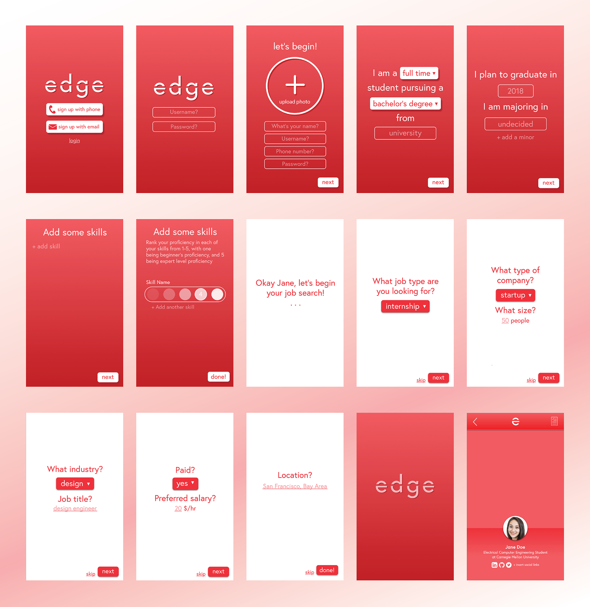
Profile creation and filtering
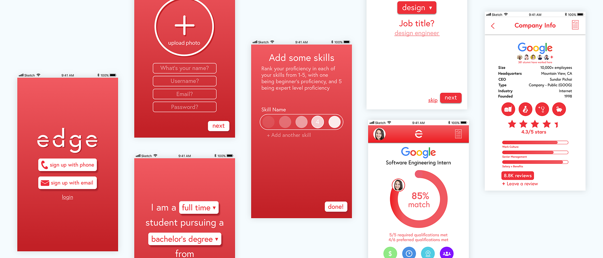
Users are only required to input standard information and have full customization of search results.

Swipe, save, and apply
The interface incorporates quick and easy interactions for browsing job postings and viewing details.

View clickable prototype